How poor are people in Sub-Saharan Africa compared to the rest of the World? International comparisons of GDP per capita do not provide an answer to this question because they ignore within-country inequality (i.e. every individual in a country is assumed to have the same level of income) and because GDP is not the same as disposable income, which more accurately reflects living standards.
In a recent analysis of the global income distribution, Branko Milanovic and I have compiled a new database of more than 550 household surveys between 1988 and 2008. Household surveys collect information on disposable income. Because there are few household surveys in Sub-Saharan Africa before 1993, we concentrate on the period between 1993 and 2008 in this blog post. Our data come mostly from the World Bank’s PovcalNet database, which we supplement with data from the Luxembourg Income Study. Every person in the world is assigned the average income of his or her income decile (in the country of residence). Incomes are measured in per capita terms and adjusted for purchasing power parity differences across countries.
Average per capita incomes in Sub-Saharan Africa (SSA) have barely changed over this 15-year period, moving from $742 to $762 per year (measured in 2005 Purchasing Power Parity-adjusted USD). When we exlude South Africa and the Seychelles, we actually see a decline from $608 to $556, which makes SSA the poorest region in the world (even more so than than India). Sub-Saharan Africa ( stillexcluding South Africa and Seychelles) is also the second most unequal region after Latin America & Caribbean. However, while in this group of African countries differences between countries account for almost 30% of inequality (as measured by the Theil-L index), they only explain 7% of observed inequality in Latin America. That is, the dispersion in average incomes across countries is very important in Sub-Saharan Africa. Nevertheless, high levels of inequality within countries is still common: in 2008 six African countries have a Gini index in excess of 50% (Central African Republic, Rwanda, Swaziland, Seychelles, South Africa, and Zambia).
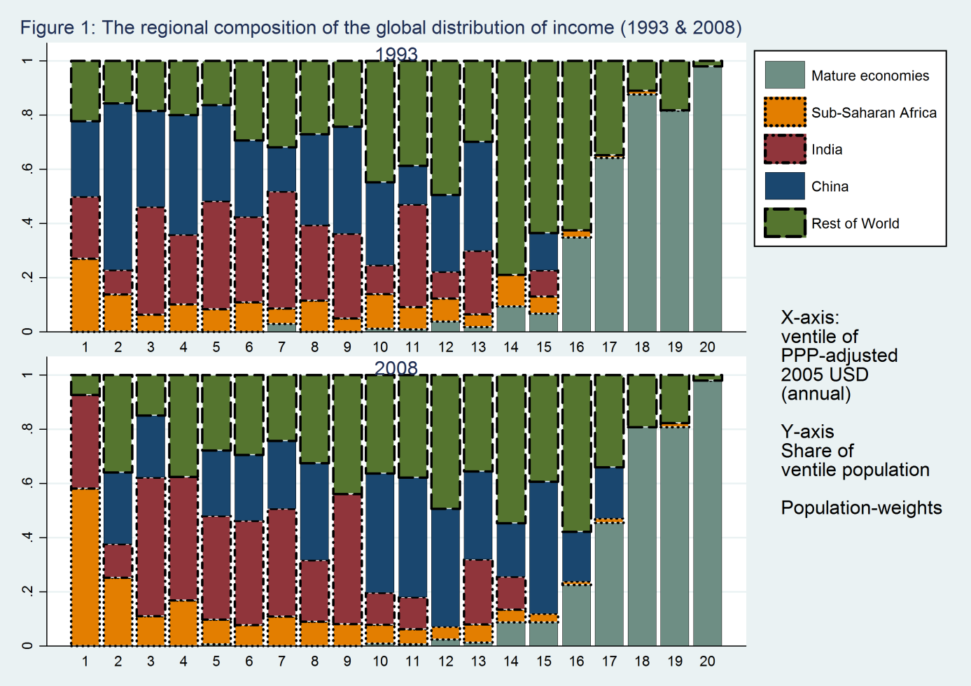
By contrast to slow growth rates in SSA, between 1988 and 2008 average incomes trebled in China, increased by 34% in India and by 68% in the rest of Asia. Because different regions have developed at such different speeds, the regional composition of the global income distribution has changed dramatically between 1993 and 2008 (Figure 1). To construct Figure 1, we divided the world distribution in 1993 and 2008 into 20 income groups (or income ventiles), each representing 5% of world population. Figure 1 shows where the people in each of these income groups live. Note that the ventile categories refer to different money amounts in 1993 and 2008, so the fact that the richest Indians were in the 15th ventile in 1993, but only in the 14th ventile in 2008, does not imply that their incomes declined.
In Figure 1 we can clearly see the upward movement of China. In 2008, the top income group in China reaches as far as the 17th ventile (i.e. between 80th and 85th percentile), compared with between 70th and 75th percentile in 1993. At the same time, by 2008 China had grown out of the poorest 5% of the world population while in 1993 it made up almost 30% of the population in that income class. Because our database consists of country-deciles (in the case of China, separated by rural/urban), this means that the average income of the poorest Chinese decile exceeds the global income cut-off for the poorest 5%. However, if we had a continuous Chinese distribution, it would of course be possible that some Chinese would have incomes below that cut-off.
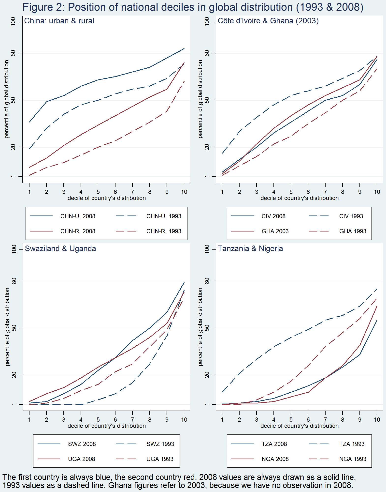
Another way to illustrate the relative performance of Sub-Saharan Africa is to compare the position of its various country-deciles in the global distribution over time. This reshuffling in the global distribution arises precisely because different countries (and different deciles within these countries) have developed at very different speeds. For every decile in the national distribution, Figure 2 shows the position in the global distribution in 1993 and 2008. The top-left panel shows the remarkable upward movement of China, which we already discussed: for example, the richest 10% living in urban China jumped from the 73rd percentile globally to the 83rd percentile. The top-right panel shows how Côte d’Ivoire and Ghana have developed very differently.
In 1993, Côte d’Ivoire was substantially richer than Ghana. As a result of the decline in Côte d’Ivoire and the growth in Ghana, this ranking reversed by 2008 (2003 in the case of Ghana). Incomes in both Swaziland and Uganda grew strongly over this period. In Swaziland, the income groups around the middle of the distribution have gained most, although inequality remains very high (Gini index of 51%). Tanzania and Nigeria have both slid down the global income distribution.
Our analysis shows that over the last 20 years Sub-Saharan Africa has lagged behind compared to other regions. As a result, an increasing proportion of the poorest people in the World live in Africa. While the region as whole has lagged behind, some countries – and some income groups within those countries – have been more successful than others. Of course this also applies globally. Hence our paper suggests natural case studies, both amongst African and other similar countries, to derive policy implications.


Pingback: Is this Africa’s big chance? | Ceteris Non Paribus